NHS
Healthcare
Content
Sole interaction designer working with a user researcher and product manager.
Intro
The recommended time for a pharmacy to receive and dispense medication is just eight minutes—a tight window not only for one prescription but for hundreds throughout the day. Working closely with a hospital pharmacy, we sought ways to integrate digital solutions that could enhance efficiency and streamline their operations. Our approach began with a comprehensive discovery phase exploring various methods of digitisation within the NHS. This research allowed us to identify key pain points and opportunities for improvement, focusing on developing tailored solutions that aligned with the specific goals and needs of the pharmacy. This collaborative process aimed to reduce bottlenecks, improve workflow, and ultimately support faster, more accurate medication dispensing.
Competitive analysis
The systems pharmacists were using at the time were heavily reliant on manual processes, including printing and scanning prescriptions, handwritten annotations to adjust medication dosages and quantities, and the use of multiple systems to manage a single task. With limited insight into the tools used by other hospital pharmacies, I drew on my experience from working in a community pharmacy to understand how private pharmacies efficiently handle high volumes of prescriptions each day. This perspective allowed me to consider alternative approaches and potential digital solutions that could address the challenges faced by the hospital pharmacy. Once the interviews were conducted with pharmacists in the hospital pharmacy, I created a site map.
Talking to users
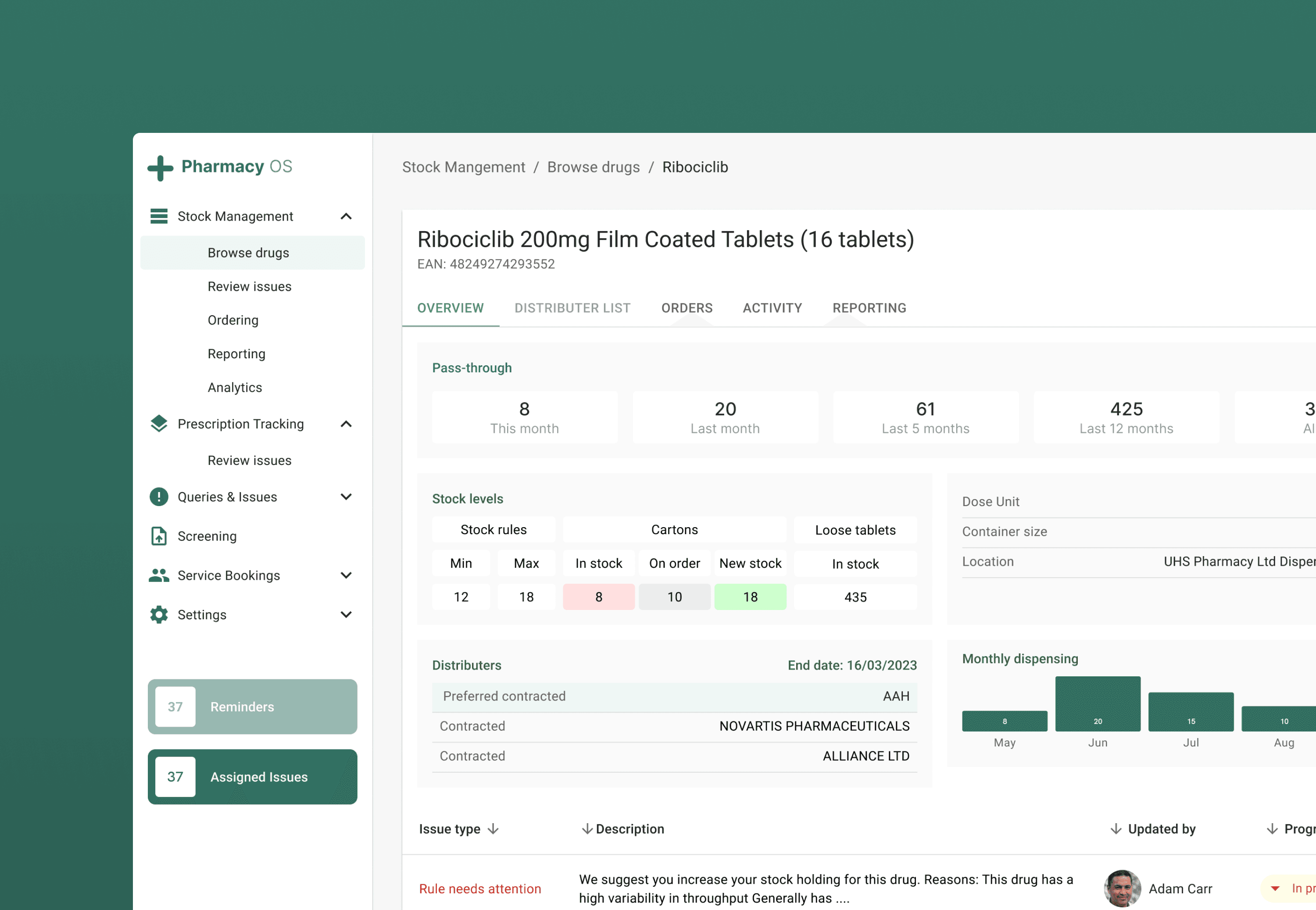
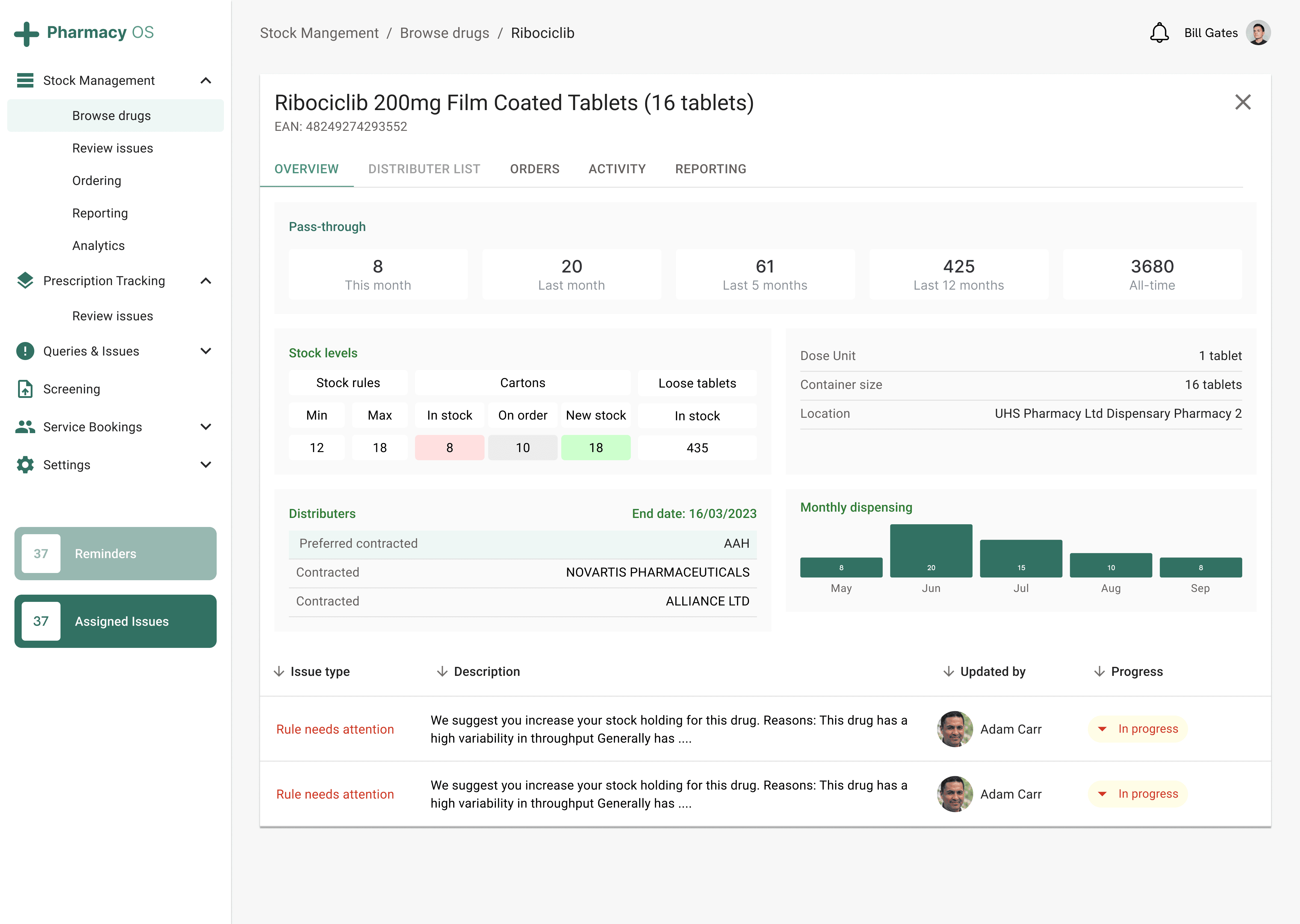
#1 Inaccurate stock check
Stock received by the pharmacy was being incorrectly booked but the impact passes through the entire process, from the initial inventory management to final dispensing.
#2 Missing prescription information
Prescriptions needed manual follow-up by the labeler to fulfill the prescription. This added extra time for both prescriber and the pharmacy.
#3 Labelling taking a long time
Data entry was manual and each prescription required the labeling team to enter all the details.
#4 Unclear prescription status
Most queries were related to the checking the status of a prescription.

The Redesign Process
I explored different ways to present the requirements from stakeholders through multiple iterations of wireframes.
I sent out a survey to pharmacists to ask them what to include within the dashboard and what to miss out based on their existing experiences.
— How can we improve user's current systems?
— How can we uphold patient safety guidelines while decreasing the occurrence of human errors in the process?
— What are the obstacles to digitisation within a healthcare setting?
This was to discover quick wins that would make it easier for pharmacists to adopt the new system. They replied with:
"We need more process transparency and who is responsible for completing the task/query. The ability to view what stage of the process a prescription is at is helpful to answer the queries from other colleagues."
"I would like a feature to let me know stock balance on a daily basis."
Using these findings, I created a simple version of an overview of the stock levels, a progress dashboard for tasks and a monthly view for items dispensed. After presenting this to users, we received feedback regarding how useful it was to see quick insights into the dispensing process. More importantly, they were able to see the issues flagged to them quicker than before, resulting in less waiting time between processes.
I re-iterated the designs multiple times based on feedback on improvements.
Addition of sub-pages to improve navigation
Removal of information not needed

Challenges
One challenge we had with mapping out the new interface was deciding what information to keep or remove from the dashboard. The users were comfortable using the dashboard they currently had even if it did not serve all their purposes, which meant we had to be cautious the changes weren't too drastic that the new designs would have a negative affect. To aid with this, I asked a few questions throughout the process to determine which features were important.
Does the feature align with the strategy?
Does it only benefit a small subset of users?
Does the usage data align with what the users are saying?
Is it expensive or time-consuming to maintain?
Does it solve the user's problem?
These questions helped shape what to include in the dashboard and make the decisions to remove a feature much easier whist still maintaining that trust with users.
Reflections
When developing a complex digital system, users often struggle to clearly identify the features they need or expect. This can result in misunderstandings or missed opportunities early in the process. In our case, we first created high-fidelity wireframes and then mapped out the user flows, which seemed like the logical next step. However, this approach led to delays as we had to revisit earlier stages when additional features or adjustments became apparent during usability testing. In retrospect, conducting a collaborative workshop to establish user journeys much earlier in the process would have given us a clearer understanding of user goals, pain points, and behaviors. By incorporating this feedback upfront, we could have streamlined the design and development phases, reducing the need for last-minute revisions and improving the overall efficiency of the project. This approach would not only have saved time but also resulted in a more intuitive and user-centered final product.